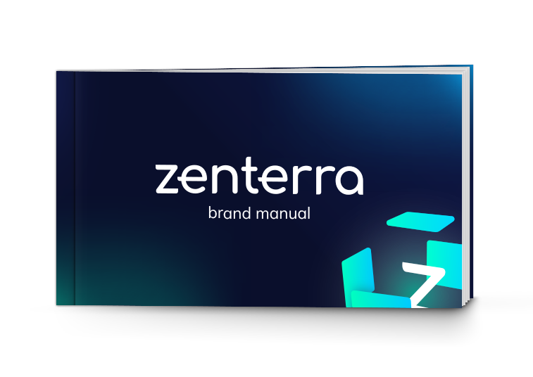

Download Zenterra's digital brandbook In it you will find all the visual rules: logo, colors, fonts and basic graphic elements. Perfect for designers, partners or for reference when creating materials.

Dark base colors and soft light accents are used.
Basic background and structural blocks. Symbolizes stability, seriousness and technologicality.
Accent color for buttons, graphics, and key elements. Emphasizes innovation and freshness.
A second accent color for graphics, hover effects, and visual accents. Reinforces the technological feel.

The Zenterra logo is clean and minimalist. It should always be clear, legible, and have sufficient contrast against the background.
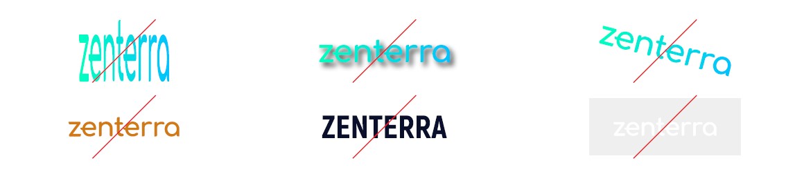
Basic rules
Correct: Zenterra, Zenterra AI, Zenterra.AI
Incorrect: Zentera, Zintera, Zenterra ai, Zentera, Zintera
Usage tips
Zenterra logo variations
Download the logo in the appropriate format
Logos for stage and event presence

The main fonts we use in our communication and design are Inter and Mulish. These fonts were chosen for their readability, modern look, and versatility.

Used for headings, buttons, and navigation. It provides confidence and clarity so that key messages immediately grab attention.
Used for main text and explanations. Creates a sense of lightness and accessibility so that content is perceived quickly and conveniently.